This illustration was commissioned as a piece of promotional art for the limited audio series ‘Hobo Code’ created by Hammer Canyon.
The show spans from the 1920’s to 2008 and centers around three main characters: Brother Issac, Gadabout Jack, and Elizabeth ‘Buts’ Wyland (and of course her mysterious imaginary friend- Missus Best Friend). The central storyline however, lies in the time that the three spend together as they travel across the country during the Great Depression of the 1930’s.
I learned of this series and commission opportunity when show creators: Paul Pakler, Shane Portman, and Ruth Gamble sent out a call for an artist to create a promotional image for the show. Along with the show synopsis, they included the desired concept and inspiration for 3 various character styles for a tryptic scene illustration.
I applied to create this illustration with a brief write up and portfolio that showed examples of my work in each of their suggested styles. I then met the wonderful creators for a video interview and we talked about the themes of the show and how I would interpret their story and original concept. Along with portraying that desired tone, they also requested two versions of the final image: one main illustration centered on the characters, and one with an expanded layout to use as a page banner.
I started by compiling an inspiration and sketch page for each character, each page began with pencil drawings in my sketchbook and then I brought in color and photo references digitally in Photoshop.
The creators wanted Elizabeth or ‘Buts’ to be portrayed in a loose watercolor style. Her character also felt the most connected to nature and I wanted to fill her section of the illustration with organic forms and muted natural colors. I was also drawn to the larger than life Sequoia trees that her character yearns to see. I wanted to give her a child- like wandering pose while still being protective of her treasured Missus Best Friend she carried in a coffee can.
Brother Issac’s character has a constant internal struggle and his past and present goals are at odds. The creators wanted to echo that dichotomy in the art of his section.
The background would be full of the colors and geometric designs of the Art Deco style Issac enjoyed in his early life, while the figure itself would be shrouded in the humble and dull colors of an impoverished monk constantly trying to atone for his past. A stained glass inspired background seemed like the perfect way to combine the bold geometry and religious tones of Isaac's two forms. I also wanted to include details of faded roses as a beautiful but painful reminder of the love he lost.
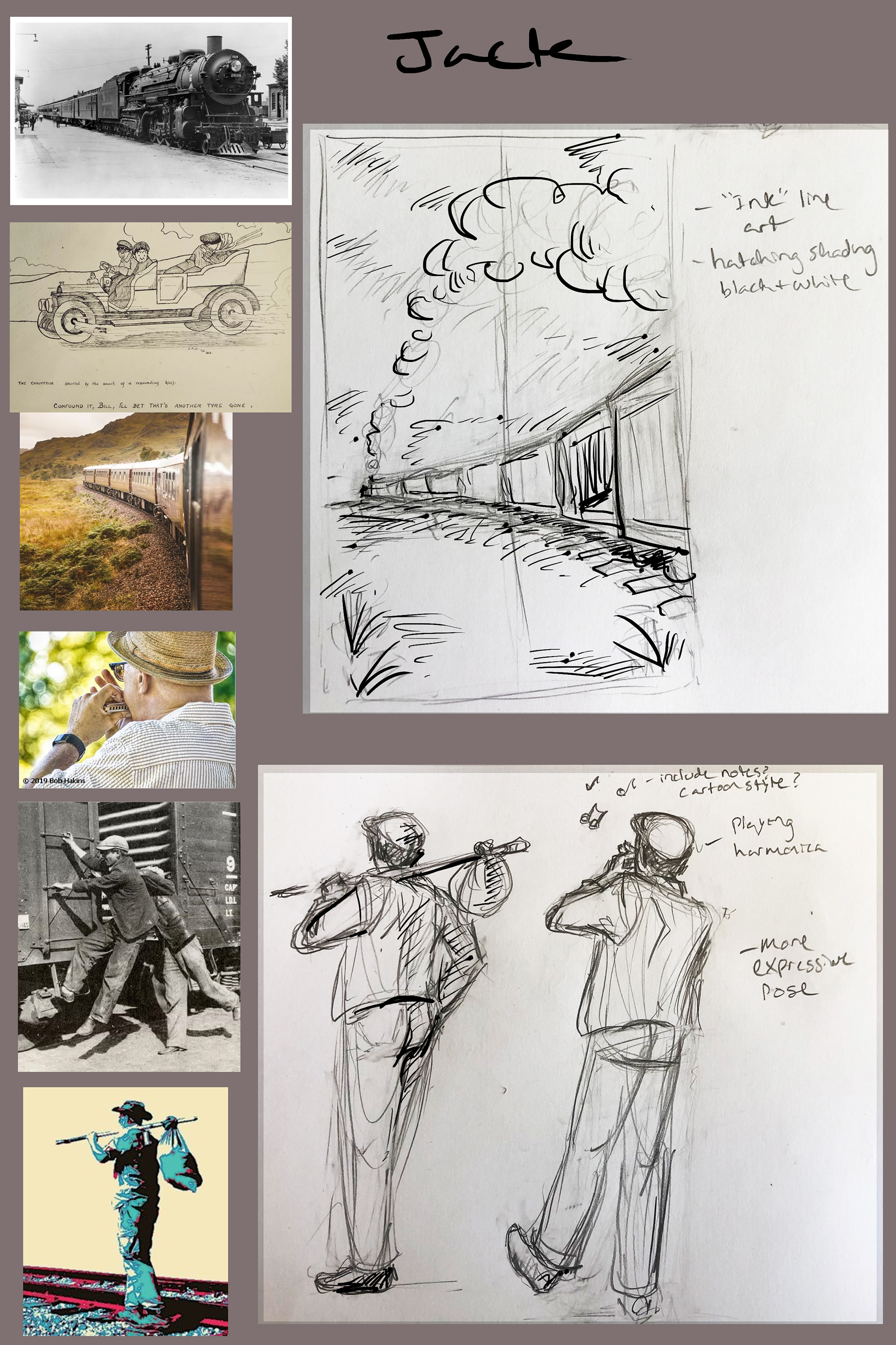
Gadabout Jack had the most simplistic concept, the show creators wanted to portray him as the stylized ink illustrations of the time. Jack’s appearance as a curly haired musician, as well as the drawing style itself would be inspired by the artist Woody Guthrie. Jack also acted as the archetypal “Hobo” in the story so he bore the typical wardrobe, bindle, and train cars classically associated with the character.
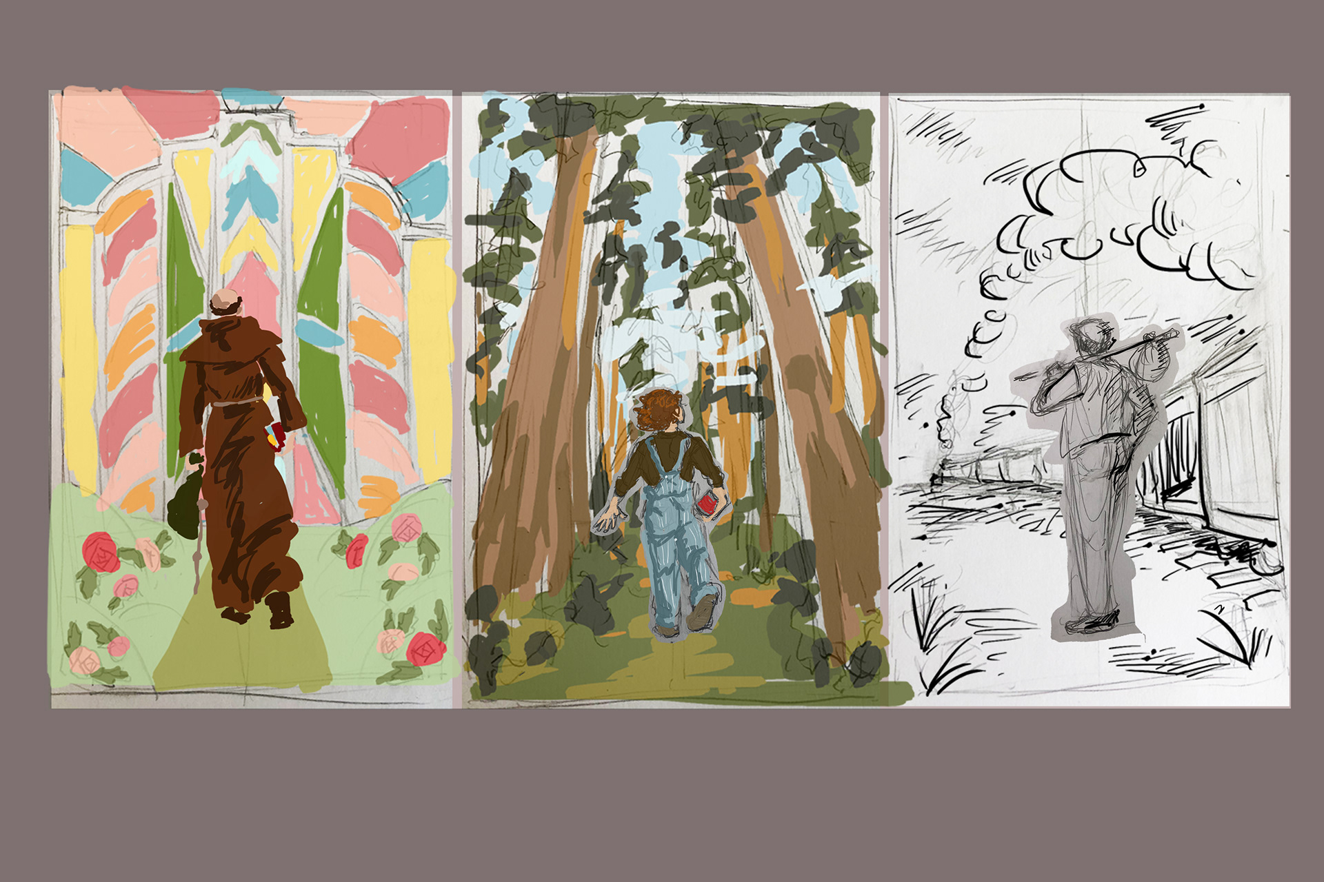
At this point in my sketches, each character was walking away from the viewer, onto their journey, but they each walked into their own separate scene.
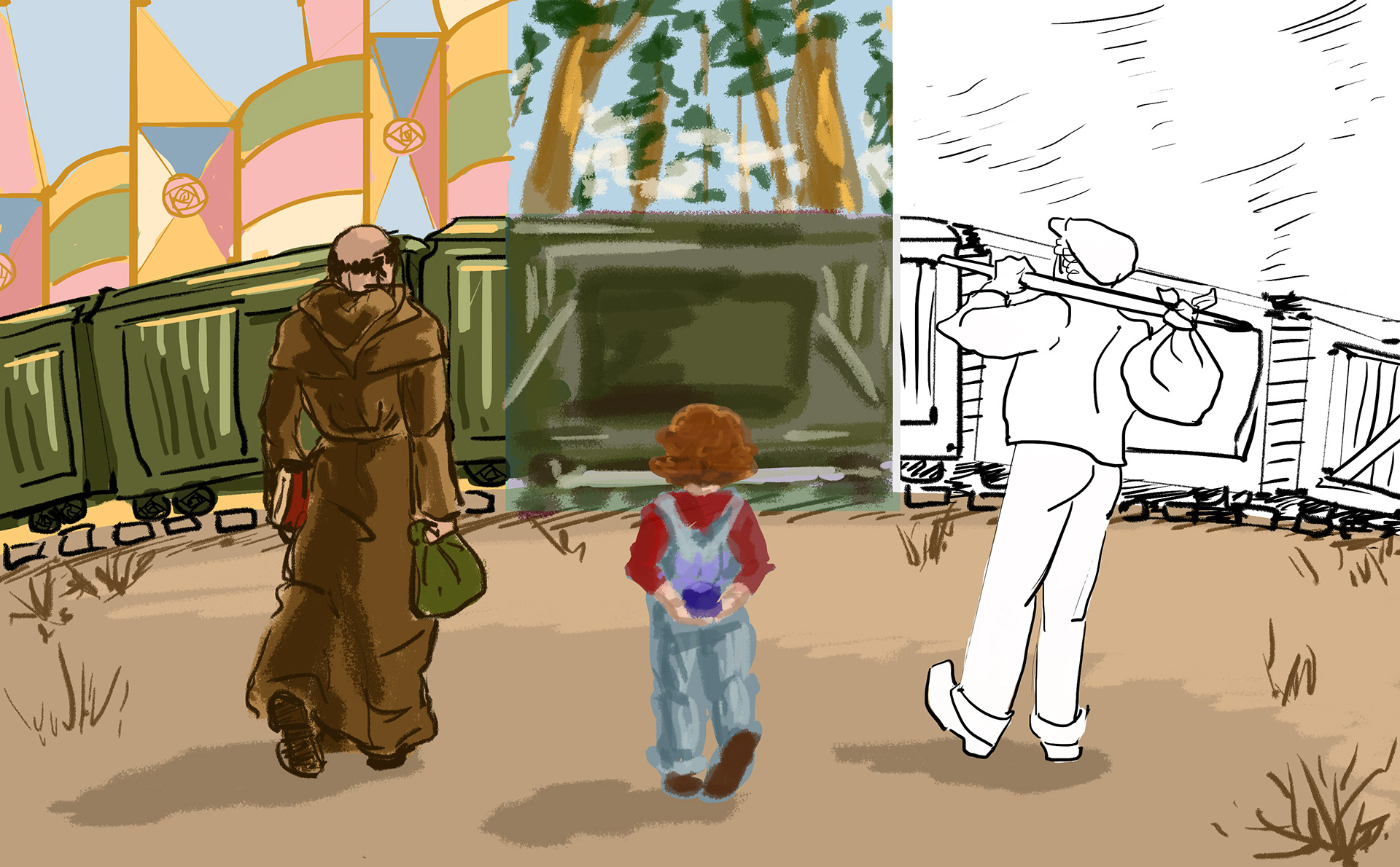

With the first round of feedback from the show creators, they were happy with the design of each character and their respective styles, but they wanted to bring them into a cohesive scene. They suggested the trio be heading toward the open car of a train that was passing directly ahead of them across the illustration. While this linked the characters in a single moment and their individual styles still showed on the train and peeked out in the background, myself and the show creators agreed that this layout felt too stagnant. Even with a rough depiction of the expanded banner image, the scene looked imbalanced and lacked the opportunities for interesting background elements.
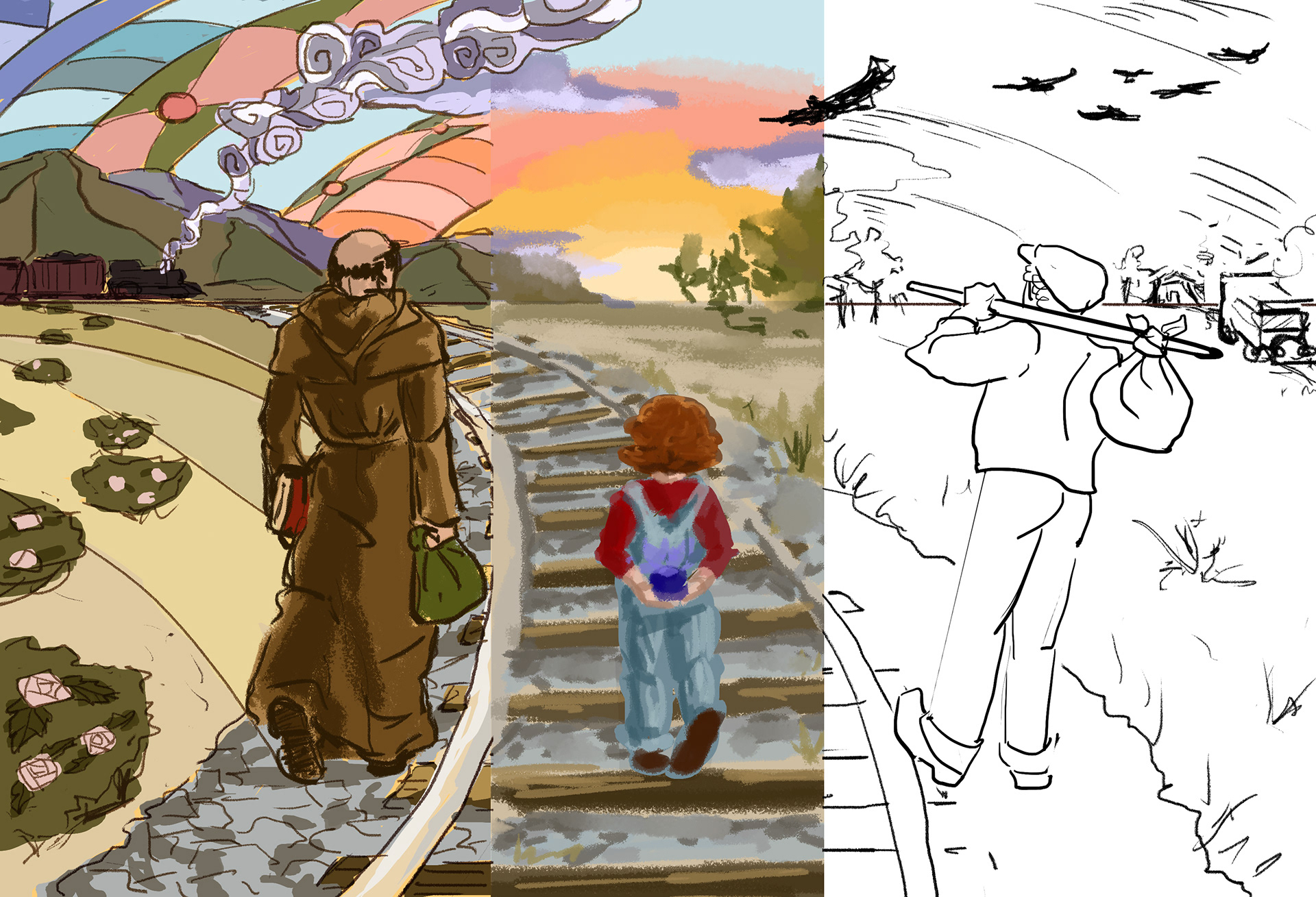
With the next round of feedback, we all agreed that the background should stay as a cohesive image, but with a more expansive scope. The characters would be walking along a train track, hoping to jump aboard an open car as the train passed. The track would lead ahead of them to a vast and dusty landscape, depicted in each character’s art style. We even had the idea to let these styles overlap into one another with a plume of smoke and a soaring vulture!
This improved layout returned the focus to the characters while still creating a landscape to capture the viewer’s interest in both forms of the illustration.

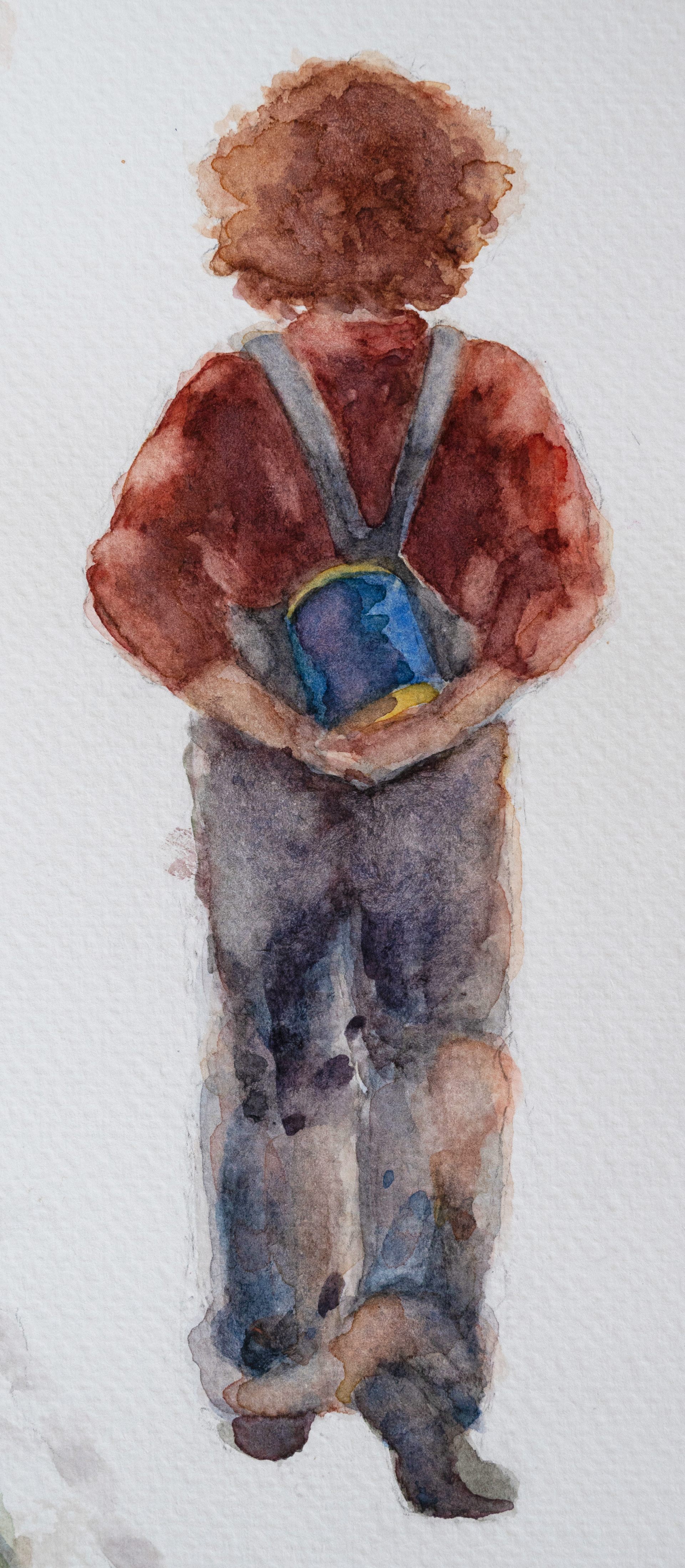
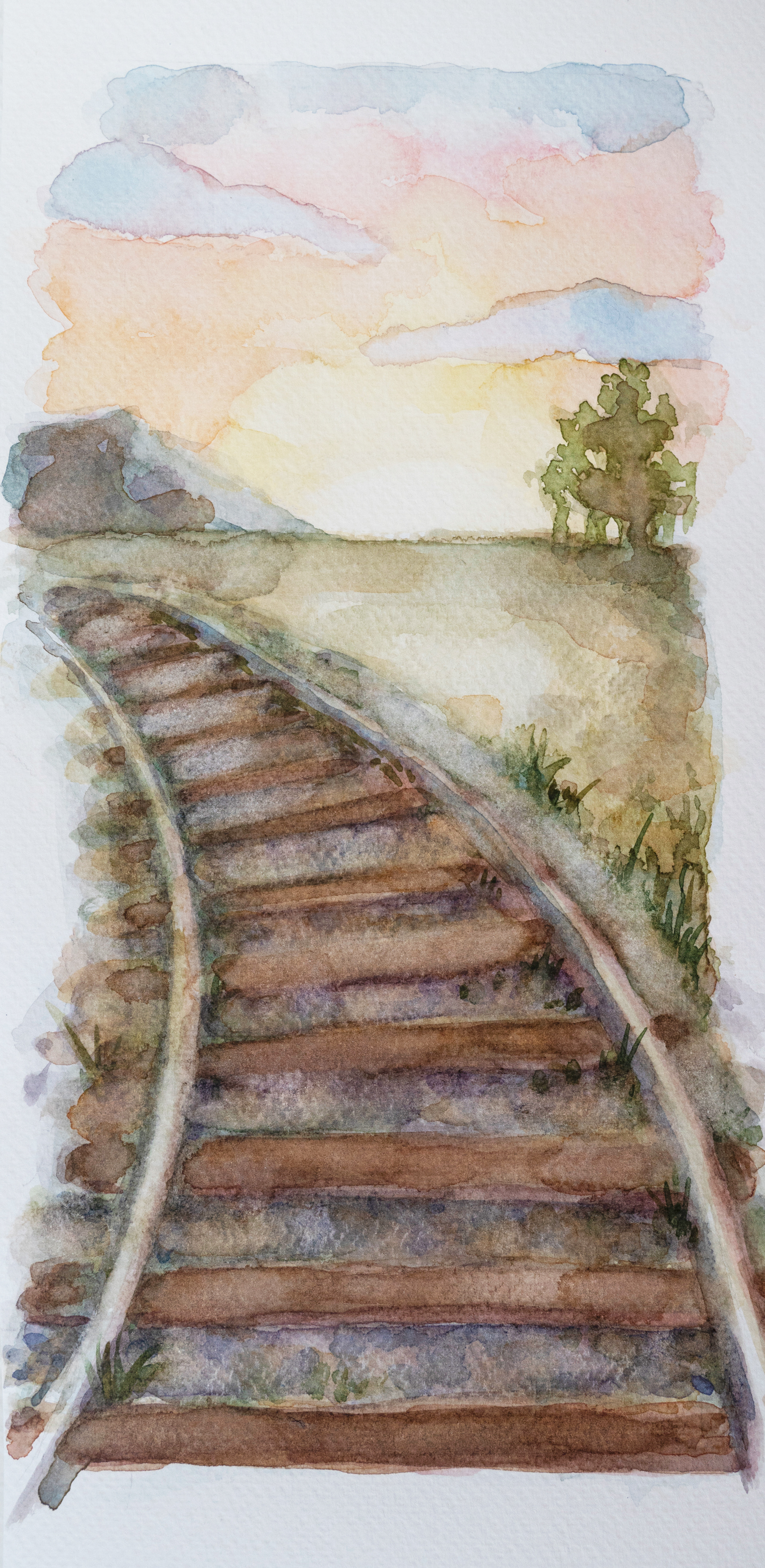
These sketched iterations were all done digitally in Photoshop so I could more easily experiment with different compositions and colors. For the final image however, the first step was to create Buts and her background painting with watercolor on paper. I drew the figure separate from the background so I could ensure both an atmospheric background, as well as a detailed figure that would stand out.
Then I brought both pieces back into Photoshop so I could size and place Buts into her slice of the illustration. I could then digitally paint the details of her clothing and bring focus to Missus Best Friend in the coffee can.
Piecing together these three styles and combining the physical and digital mediums was the final challenge of this illustration- and I am very pleased with how they came together. Issac’s abstracted colors and Jack’s black line on a paper-toned base each complement and contrast the texture and natural feel of Buts’ center panel to create a captivating and emotional glimpse into the story of ‘Hobo Code’.
Written October 2024