This piece was assigned in the Spring of 2020 as the final project for my portrait drawing class in my junior year at VCU.
(This was a unique process, as it was one of the few school projects that began in a classroom and was finished remotely due to Covid quarantines. The prompt was given and my initial sketches were done in class. When an uncertain “break” began, I went back to my home in Michigan for a time. I finalized my design there and then when online classes were officially put in place for the rest of the semester, I came back to Virginia. I completed my project from home and received notes and a final critique from my class via video calls.)
The prompt for our final project was to create two self portraits, rendered in color, portrayed in a nature theme. The two themes I was immediately drawn to were a tree form and a constellation of stars- some other interpretations in my class were a sky of clouds, a bouquet of flowers, and even some animal look- a- likes.
My constellation portrait turned out fine, and I still really enjoy the concept behind it, but at the time, most of my enthusiasm and attention went to the tree portrait. As a result it had a much more thought out process and I am happier with the final piece.
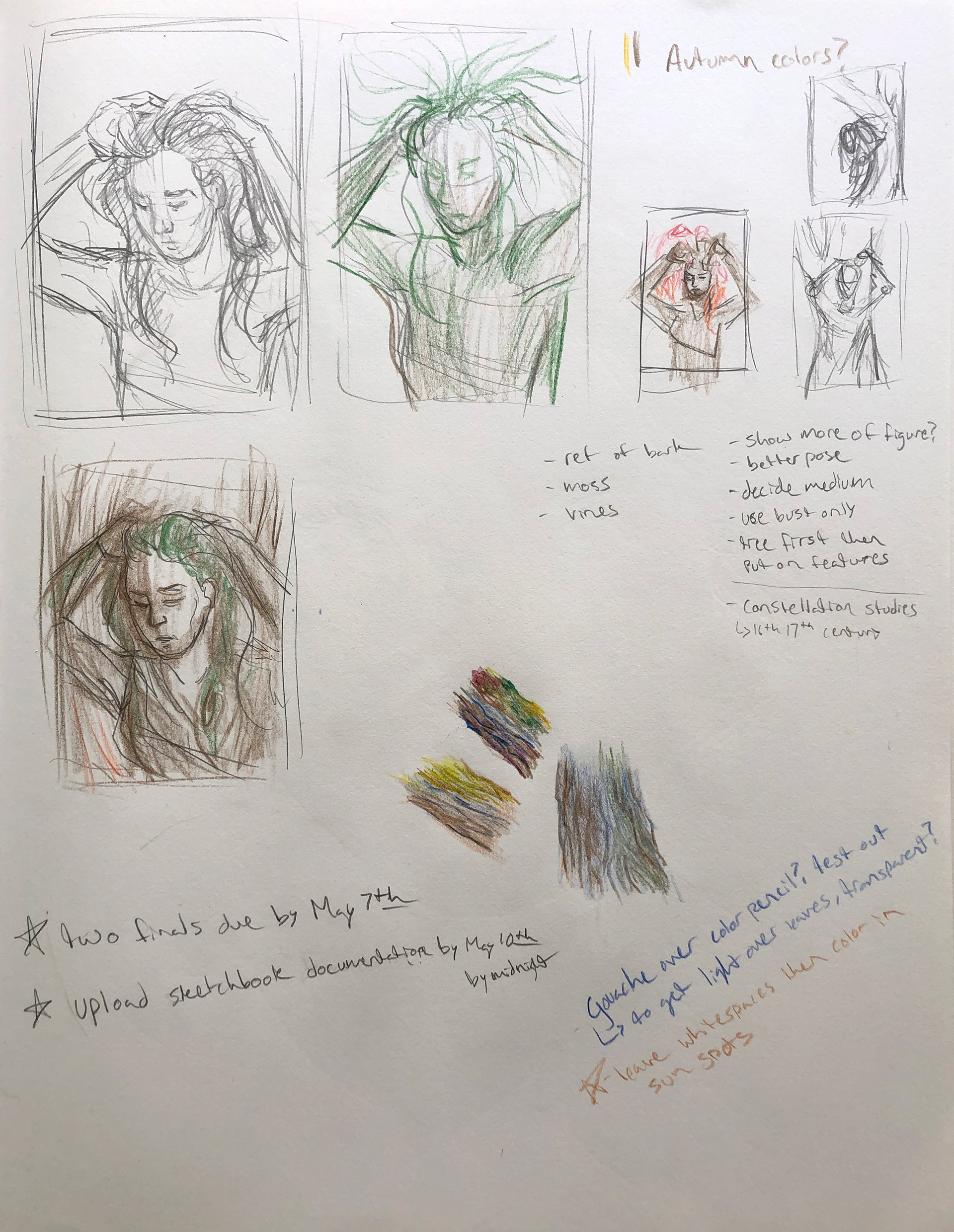
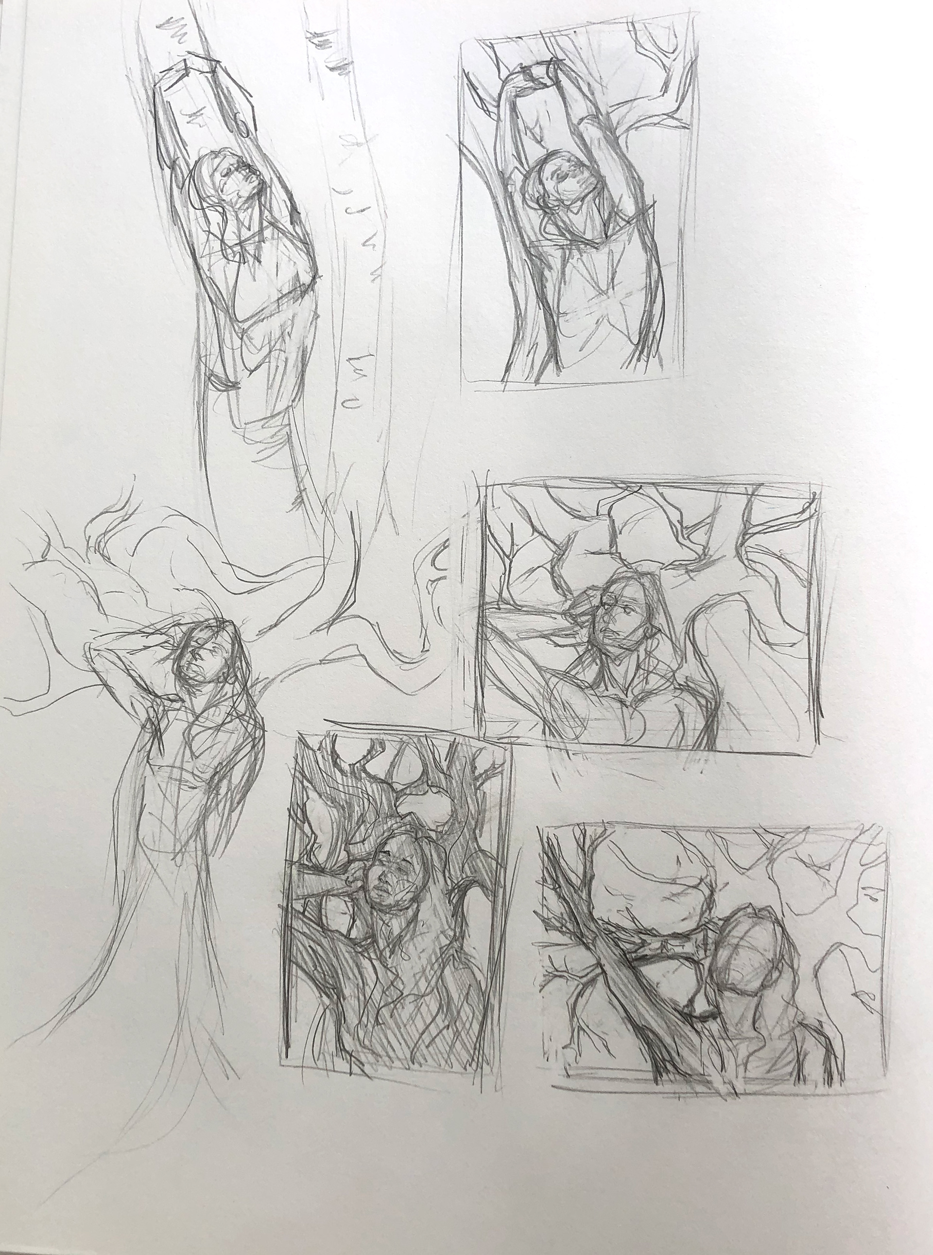
I began with the tree theme by sketching out different ideas for the pose and how I would incorporate the tree’s features into the figure.
Some of my original ideas included my hair spreading into the canopy of leaves, or expanding the frame of the image and having my figure stretching up high to form a tall tree trunk. I really liked this idea of designing the entire tree around the form of my body but, as this was a portrait drawing class, I had to keep the focus of the piece on the figure’s face.
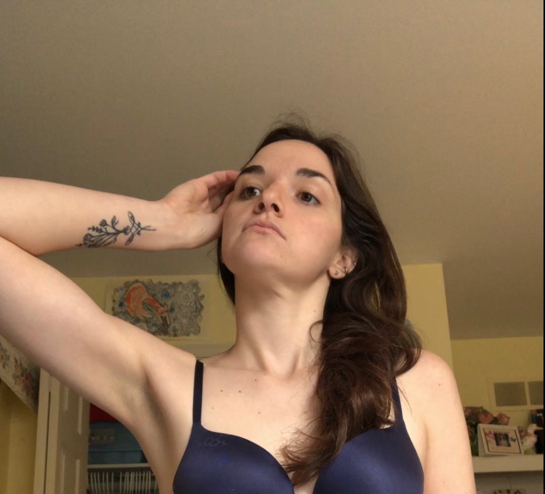
After taking some reference photos of myself, I decided on this pose. The focus still remained on my face, and the opportunity to incorporate my arm as an outstretched branch was exciting. (I also really liked the idea of including my wrist tattoo as if it were carved into the tree.)
Once the reference pose was selected, I started sketching out how the figure would be incorporated into a tree form. I was drawn to the idea of a large twisted tree, where the figure makes up the main trunk and branches extend out behind and in front of it. This is also where I got some helpful feedback from my class to abstract the shape of the arm a bit. Instead of the literal depiction of the arm, it would be made up of two different branches that intersect creating the illusion of a bent elbow.
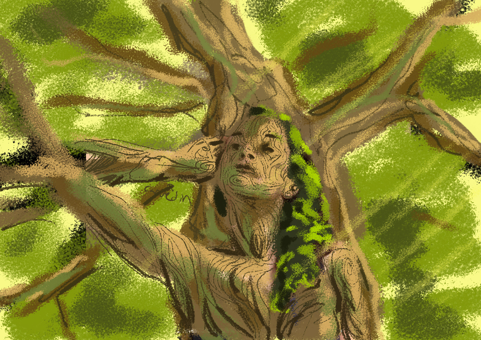
From here I went to Photoshop, coloring over both my sketch as well as the reference photo. My goal was to get an idea of how I would color the final drawing. I wanted to play with the effect of sunlight coming through the leaves, to see how it would light the figure in interesting ways. These colorings didn’t give me an exact plan, but I kept it in mind as I was still deciding on the medium and process for coloring the final piece- at this point I was between color pencil and gouache for transparent light rays.
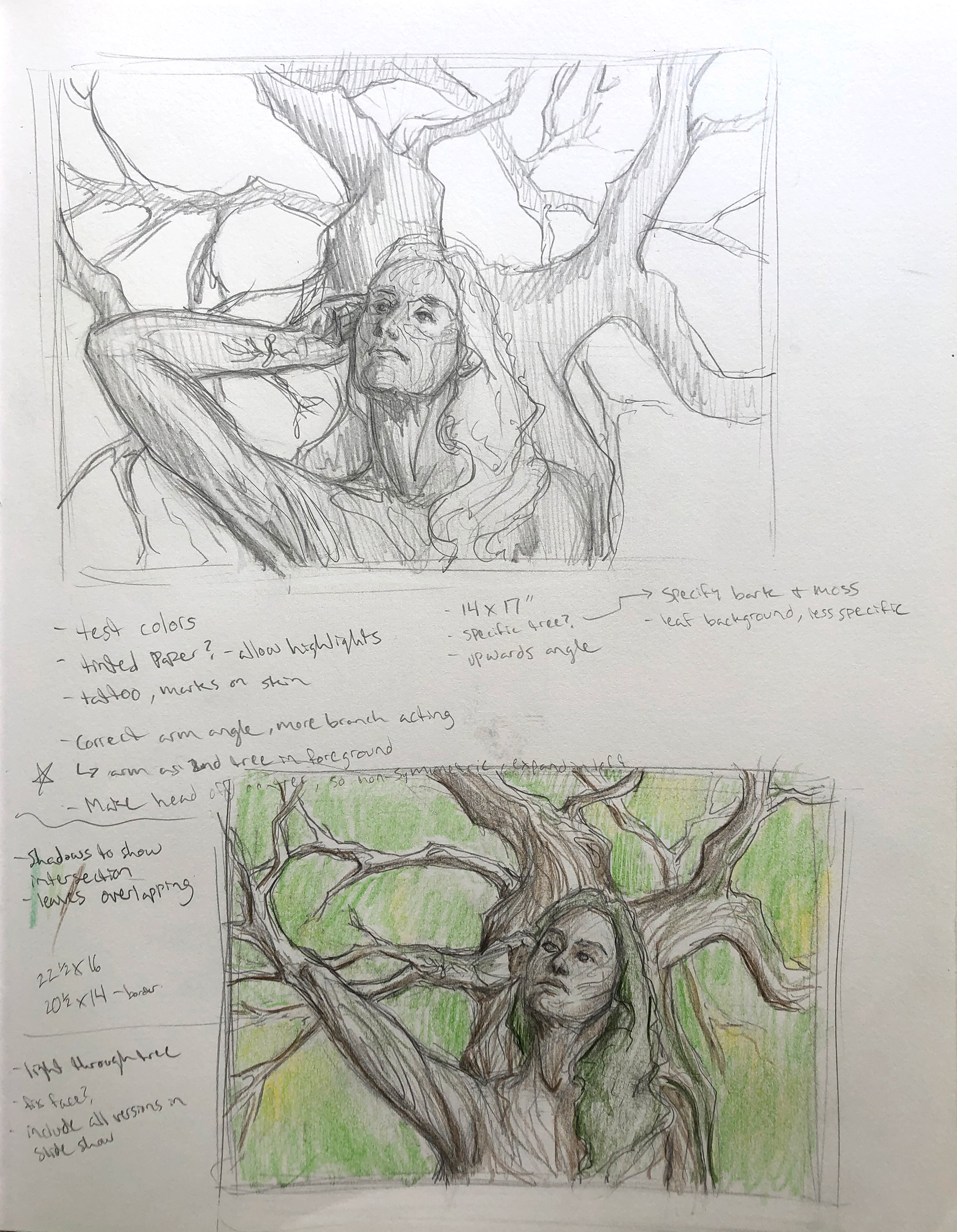
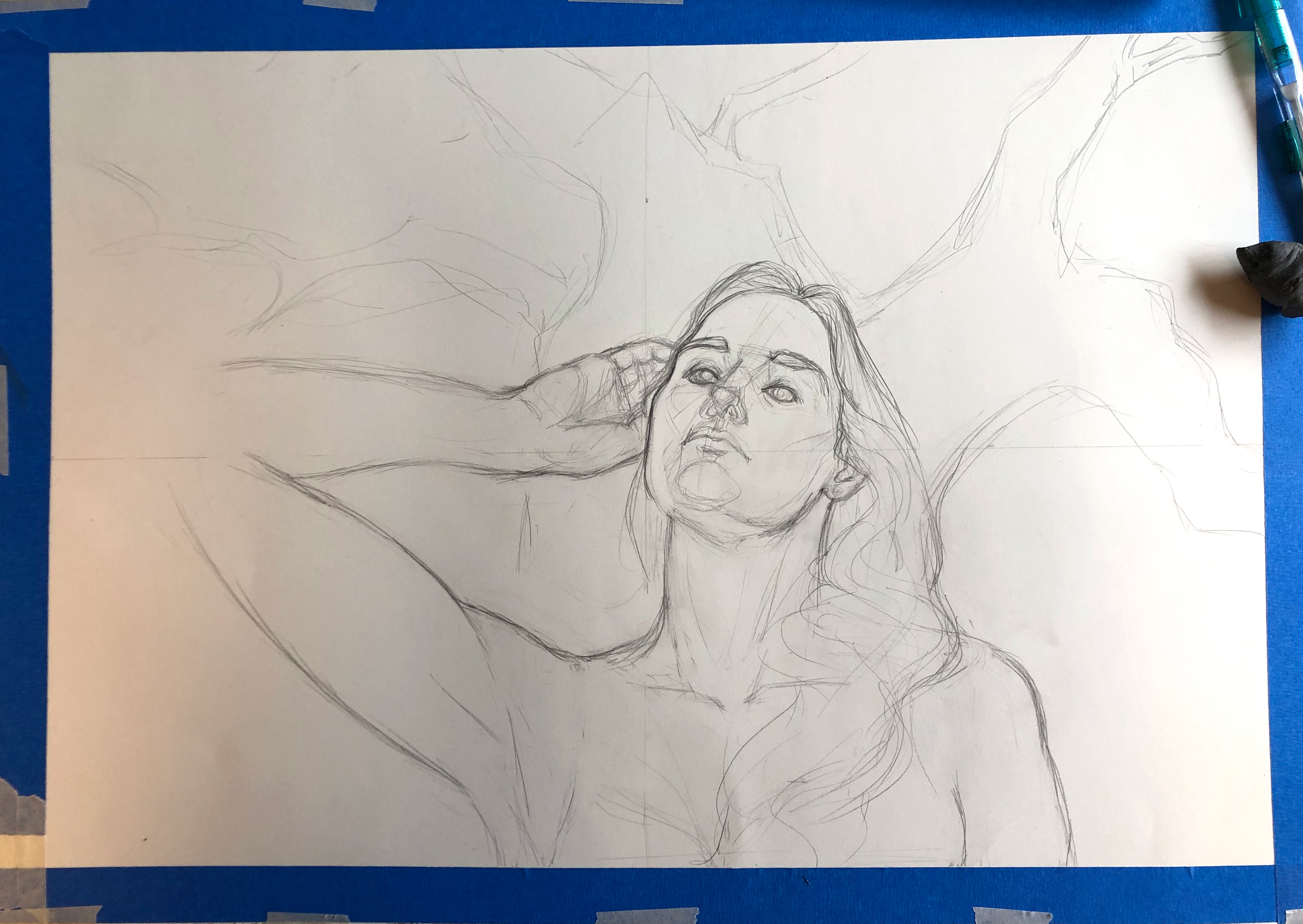
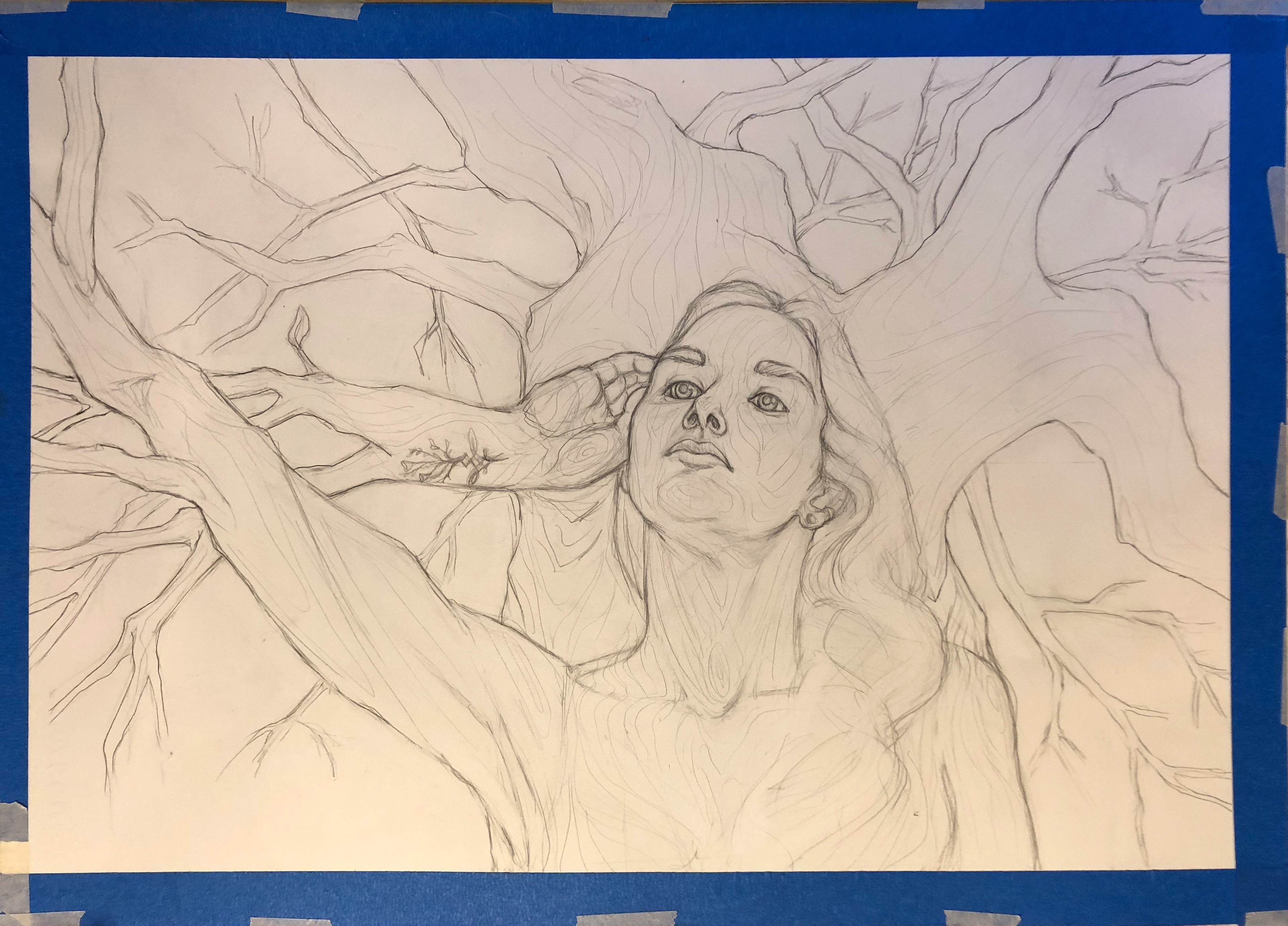
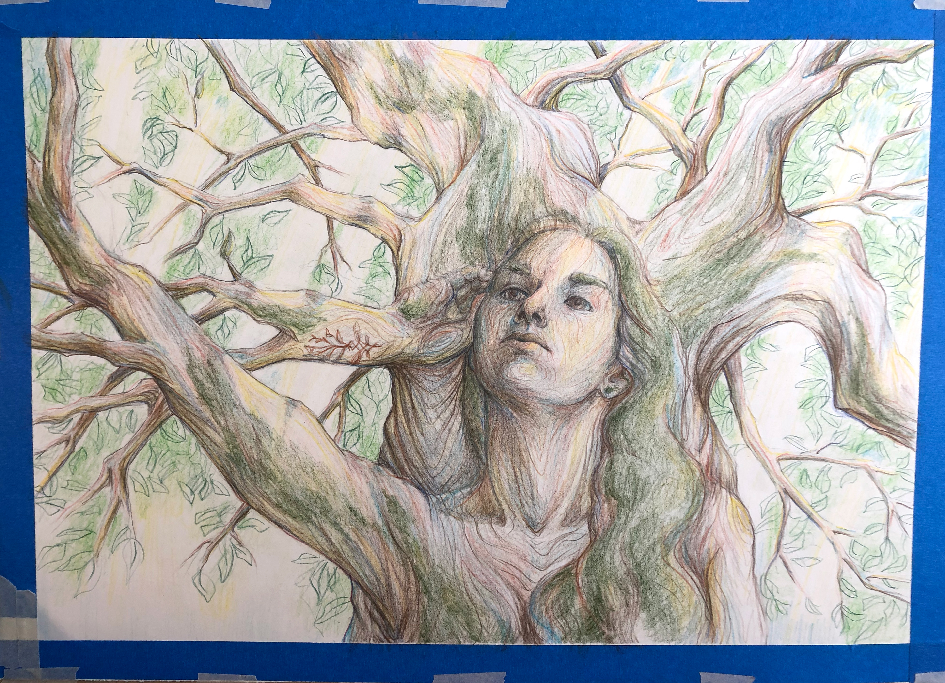
I began the final piece on paper, drafting out in pencil the placement of the figure and the tree form- then I focused on getting the figure as close to the reference image as I could. Once the figure was established, I then fleshed out the main details of the tree such as the background branches and the lines of the bark.
I once again went to Photoshop and brought in this most recent version of the drawing. Now that I knew what the final image would look like, I could more accurately map out where the sun would come through the top branches and highlight the figure.
Now that I had that clear guide, I decided that I would color the piece using only colored pencils. I didn’t have to use gouache for transparent sunbeams if I had the lightest spots selected from the start and built up from there.
With the sun beams and their main highlighted points established in yellow, my next step was to mark the shadows and points of crossover with a dark blue. The light ‘bark’ lines really helped at this point, they acted as contour lines to follow and create the shape and dimension of the tree. All other mid points were covered in a light brown as a base color.
Next, I began filling in where the green of the moss would cover the tree and figure- starting with my hair and then placing it along the shadowed sides of the branches where moss would be likely to grow. This is also when I began filling in the darker portions of the canopy and sketching in the leaves.
From this point, it became a process of slowly layering on more and more values until the portrait and background were fully rendered. This meant continuously building up the color and defining key details and lines.
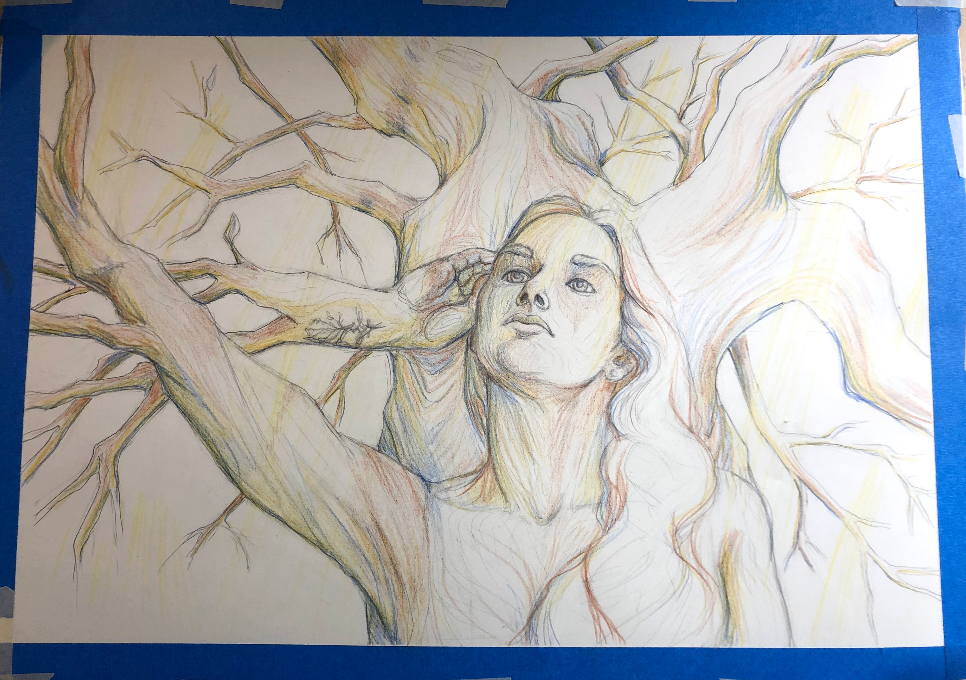
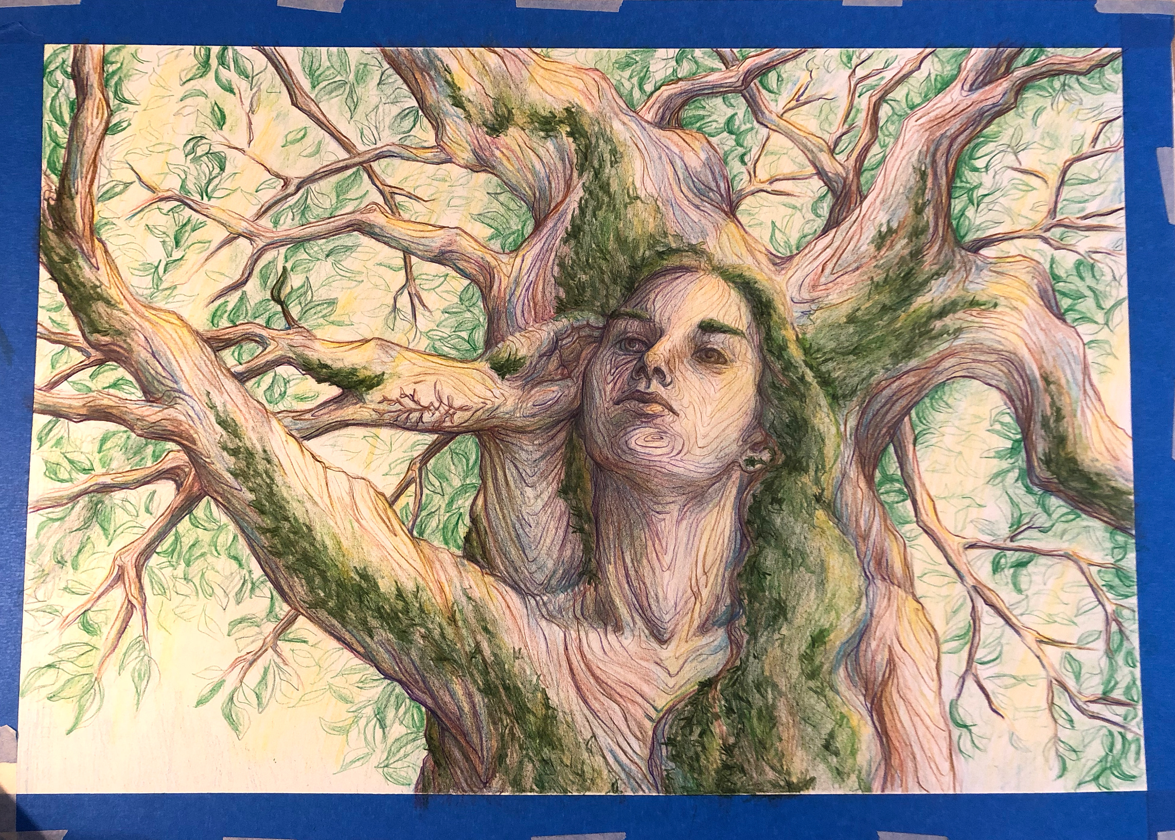
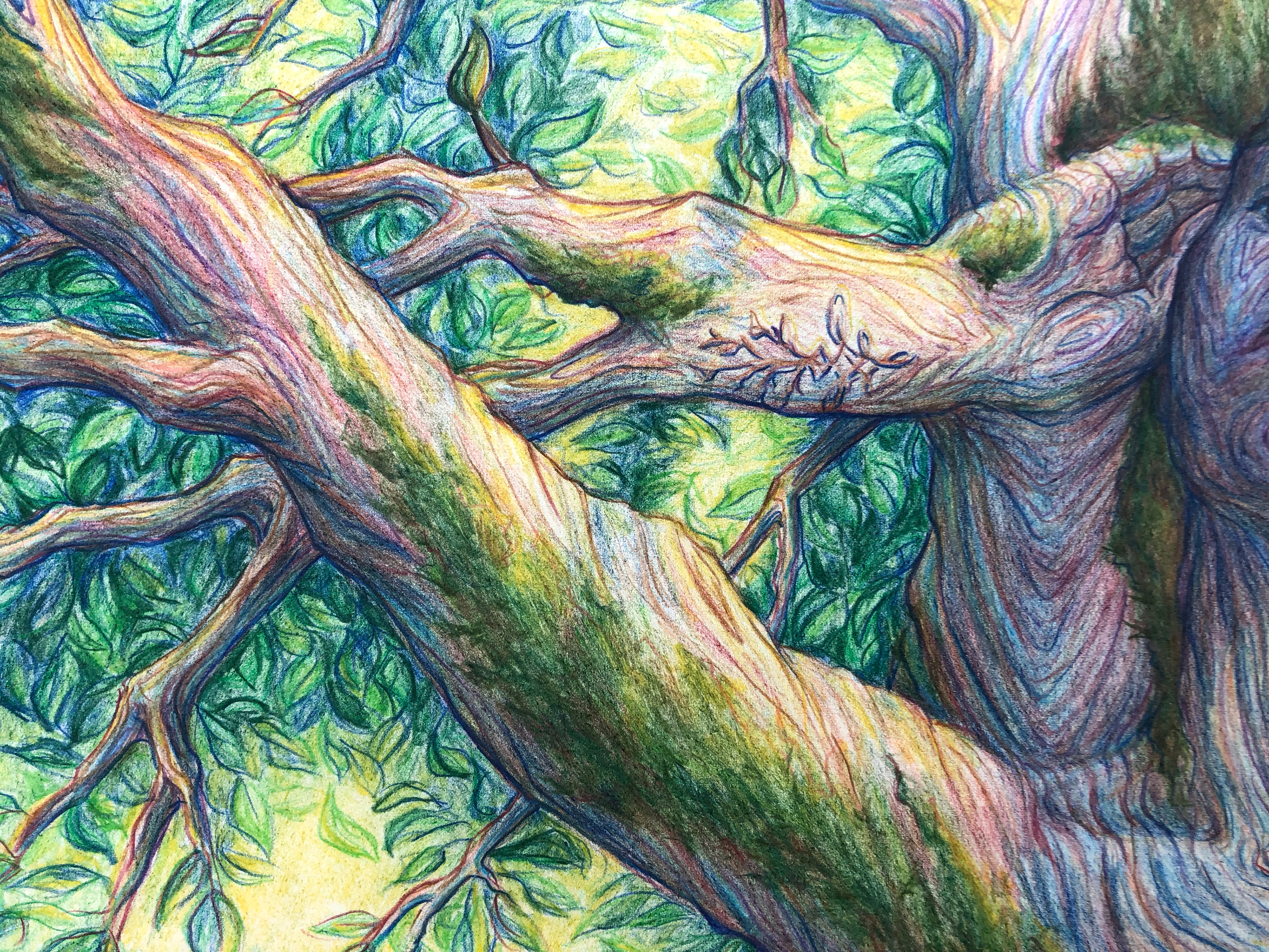
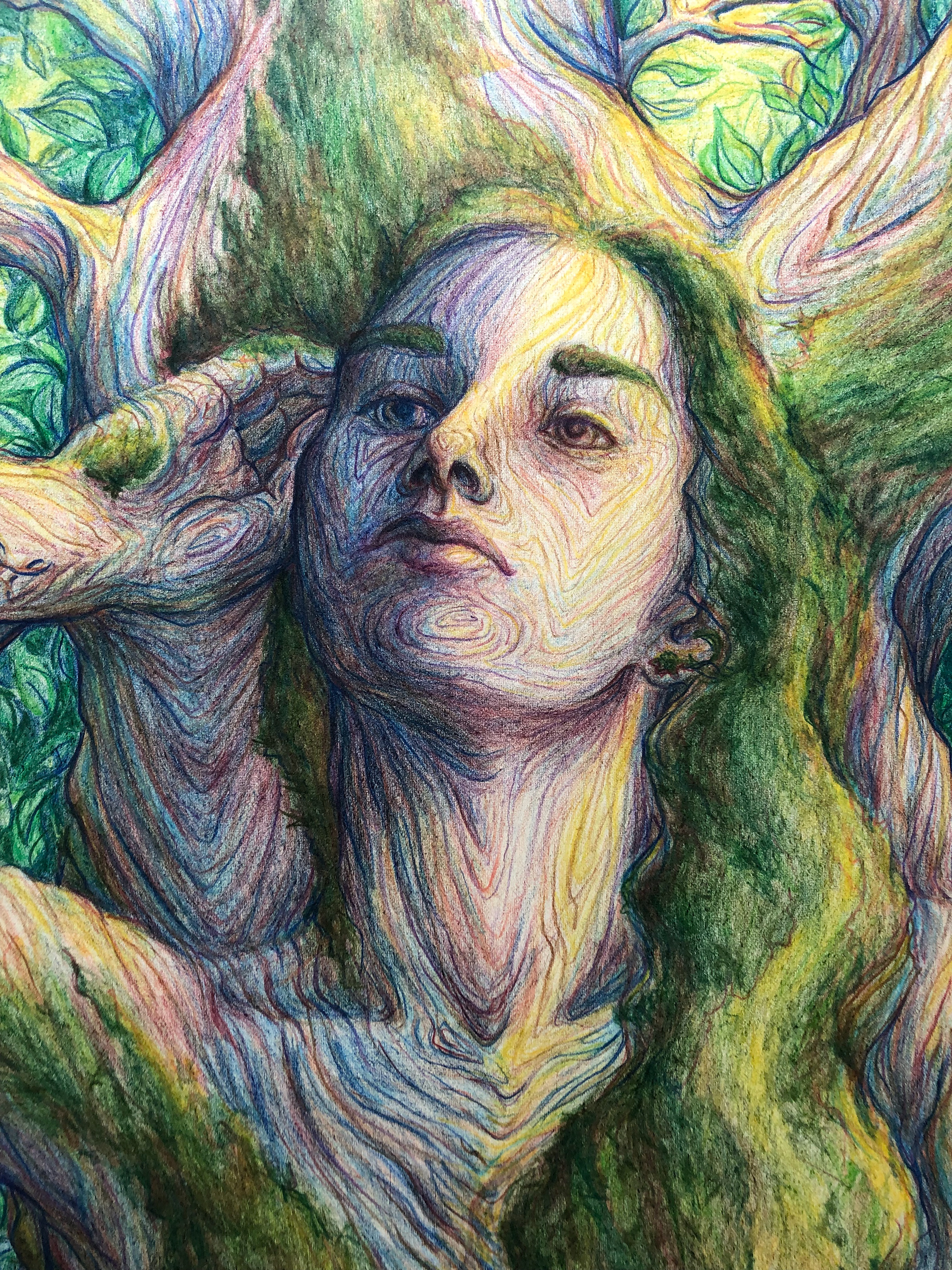
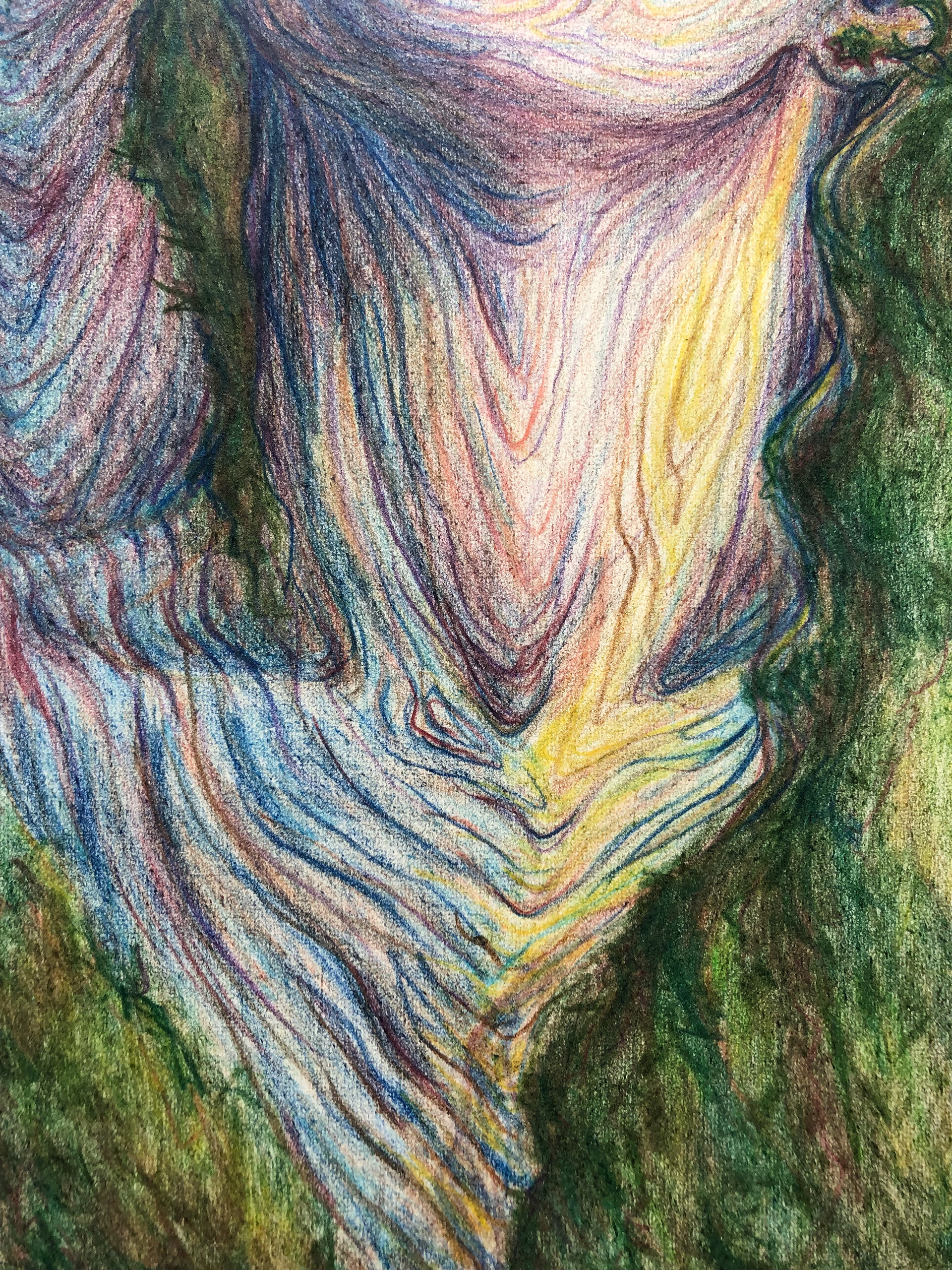
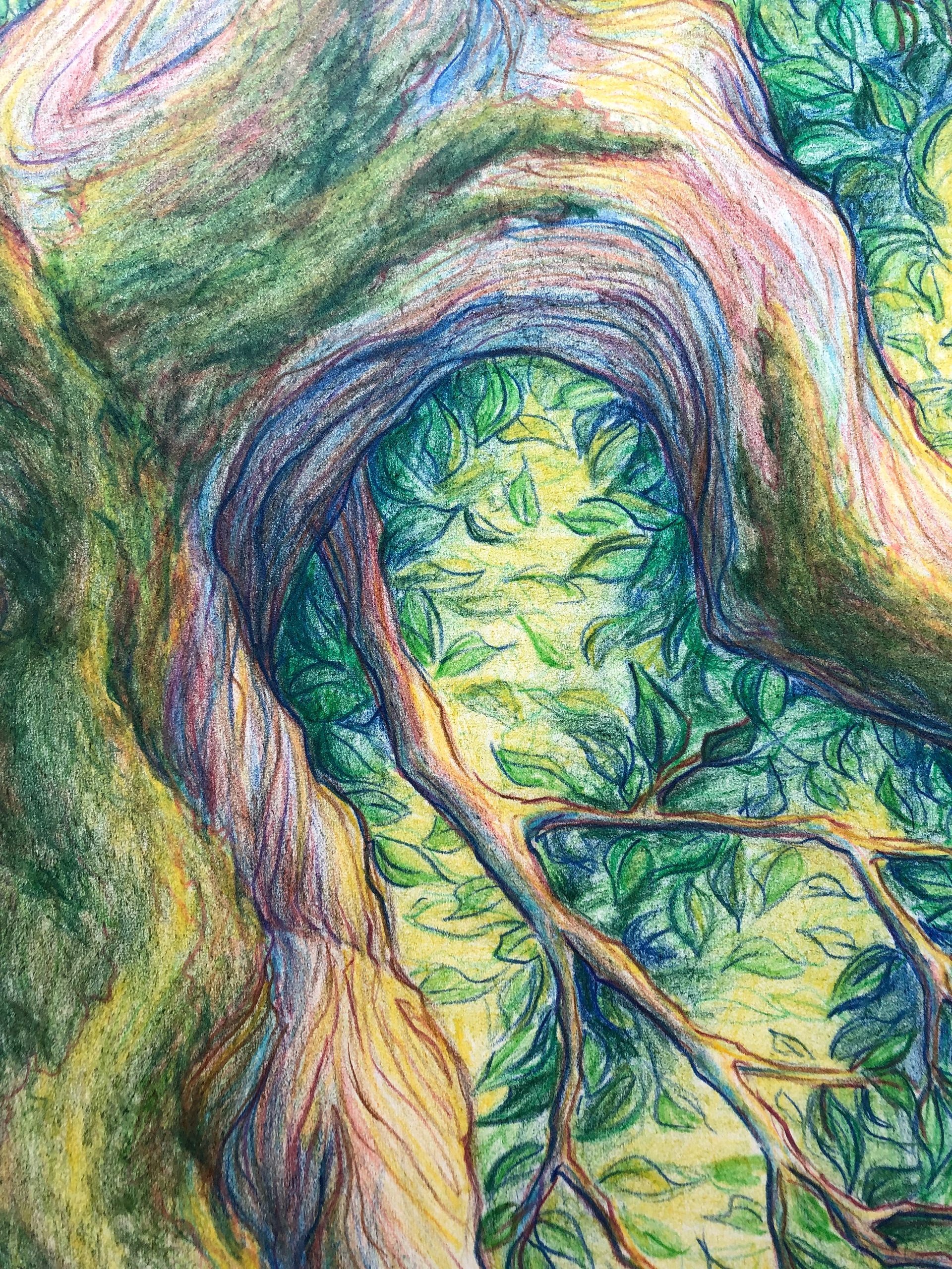
Those elements of color and line became my favorite aspects of this piece.
Color- the final image has a bright and surreal quality that was not present in my earlier color sketches and I think that is because I changed my approach to color about halfway through this project. Once I had a light layer of brown over the mid-tones of the tree, I decided that I wanted to build up the rest of the color with layers of warm and cool tones- like you would a watercolor painting. And I figured, with all those colors so closely combined and some key accents in brown, then the tree form would give an illusion of a neutral brown bark. Whether that thinking was successful or not, it did allow me to portray the light and shadow of the piece with rich color and make for my favorite moment of the portrait. The two eyes, one cool in navy blues and purples, and one warm in golds and reds- but both belonging on the same face. It reminds me of the variety of color you can see in brown eyes and hair when they’re illuminated by sunlight.
Line- alongside the base color, the color and quality of the lines on the tree are what make this piece. The lines work to marry the carefully observed figure drawing and the fictional idea of the tree. They traverse over and define the features of the face and body while hinting to the viewer as to how the figure connects to the tree. They invoke a storybook illustration feeling- creating a world and story that the viewer can imagine for the piece.
Written November 2024